Overview
In this example we will create a new dashboard report in which we will:
i. |
Produce a stacked bar chart that displays number of circuits (count distinct CircuitId) status by groups of InventoryStatusId (Planned, InService, OutOfService, etc.) |
ii. |
Produce a filter mechanism (combo box) in which to group data results by product name with option to display group as “all” |
iii. |
Rename various titles and labels |
The result will be similar to the screenshot below, where the user selects from the
1.Product Name combo option
2.Total number of connections displayed by status

As before:
▪From the Dashboard Actions tab, click on the Create New option to open up a new Designer pane
▪Amend the Permissions tab options as required for this report
▪At this point, go ahead and save your work as before
▪Back on the Designer tab (now containing your new dashboard name)
▪Click on the Chart icon in the toolbox and drag it onto the Designer pane.
![]()
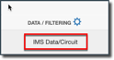
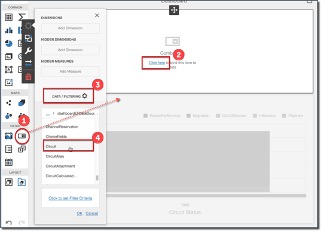
In the same way we did in a previous exercise, go ahead and bind this new dashboard to the Circuit data as in the following 2 screen shots:
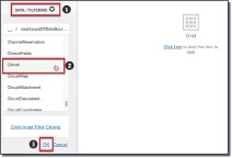
▪Click OK
▪Confirm the data binding
▪Click on the Designer background (containing the Chart) to open up the Chart setting menu
The following screenshot with numbered steps will now need to be completed, proceed with the following 6 steps:
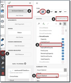
1.Select the Binding option
2.Click on the Add Values item
3.Locate and select CircuitCounts, then Id in the list of binding data sources
4.Confirm your selection by verifying your result next to the Binding title
5.From the Summary Type option, select Count Distinct – this will tie into the Combo Box selection which will be touched upon later.
6.Select the Stacked Bar icon
This next section is for the chart to include the grouping of connections by their status. This forms the “stacked” aspect of the chart.
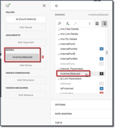
▪Click on the Series section just below the Values and Arguments sections
▪Locate and select the InventoryStatusId data source as in the above screenshot
▪Close the Binding section and open the Data Shaping section
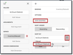
▪Locate and select the Id (Count Distinct) item from the Sort By dropdown list, this has the effect of sorting from least number of connections (foot of chart) to the most (top of chart)
▪Save your work
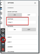
Give your dashboard report a suitable title by:
▪Selecting the Options item from the Chart menu
▪Click on Common option, then the Show Caption and rename the default Chart 1 to something like Number of Connections by Status
You should now have a report looking like the next screenshot – notice that the mouse-over reveals a finer granularity of data.
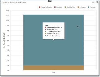
We will now change the X and Y axis labels:
▪Staying with the Options item in the Chart menu, select Axis X
▪Locate item Title Text and rename the default to Circuit Status
Repeat the above for Axis Y and rename the default to Number of Circuits
The result should look similar to the next screenshot:
The final piece to work on now is the Combo Box item. The above diagram is ok yet it is a whole sum of all circuits, and does not provide for a more granular look at the data.
As mentioned at the beginning of this section: Produce a filter mechanism (combo box) in which to group data results by product name with option to display group as “all” .
▪Select the Combo Box item from the Filter group and drag it onto your Chart report in the Dashboard
▪As before, go ahead and add a data source fields to the Dimensions group by clicking on the Add Domain button - as shown in the following screenshot
oFrom the Binding option, drill down the Circuit data source to locate Product and then select Name
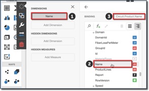
▪Click the left facing arrow above the Binding option
We will now give the Combo Box an appropriate title name:
▪Click on the Options item in the Combo Box menu
▪Rename the Caption of this Combo Box to Search by Circuit Product Name
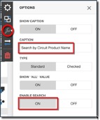
▪Optional: should you wish to allow for text entry search then click ON under the Enable Search option (allows for manual typing for search)
▪Close the Options menu
▪and Save your work
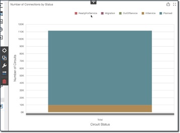
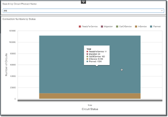
Your Dashboard should now look similar to the following screenshot, you can also mouse over any section to obtain a finer level of data detail. Notice how the Number of Circuits (Y axis) reads over 100,000, this is because the dashboard is reporting on all circuits in IMS
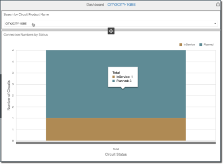
You should now be able to test the filter mechanism by selecting an entry from the dropdown list provided, in this case a Product name of City2City-1GBE produces the following dashboard report:
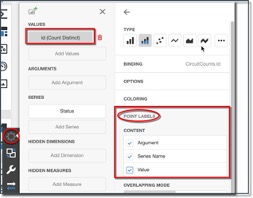
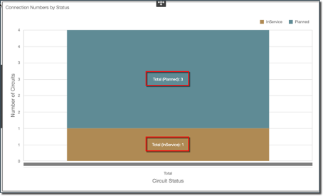
One final modification we can make to this dashboard is to add some text information onto the actual bars of the chart, by simply:
▪Clicking on the Binding item in the Chart menu
▪Click on the Id(Count Distinct) value field
▪Select on all 3 of the Content tick boxes under the Point Labels option
▪Now Save your work
(See next screenshot)
You can test these tick boxes and their effect on the chart to suit your style of reporting presentation.
This now completes this exercise.