This dashboard based report exercise is made up of two parts, but the result is still a single report.
The first dashboard exercise (3.1) will uses a pivot table to display the total number of nodes in each city.
The second dashboard exercise (3.2) involves adding a pie chart to display the total number of nodes by vendor.
Dashboard 3.1 – Pivot Chart: Number of Nodes by City
Overview
In this example we will:
i. |
Produce a list of all cities with their total number of nodes |
ii. |
Reformat the numeric value from thousands (K) to single units |
iii. |
Reduce the result set to just the top 10 city names with the greatest number of nodes |
iv. |
Rename the Pivot title |
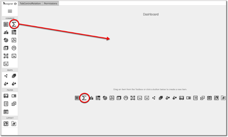
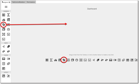
From the toolbox or dashboard panel drag the pivot icon onto the dashboard.
We will now bind this item to a data source by selecting the Click here link in the centre of the dashboard, just underneath the pivot emblem.

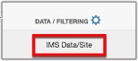
The binding menu is displayed so we now click on the main data source (IMS) at the foot of the menu. This allows us to search for and select the Site class that we require for this Pivot item.
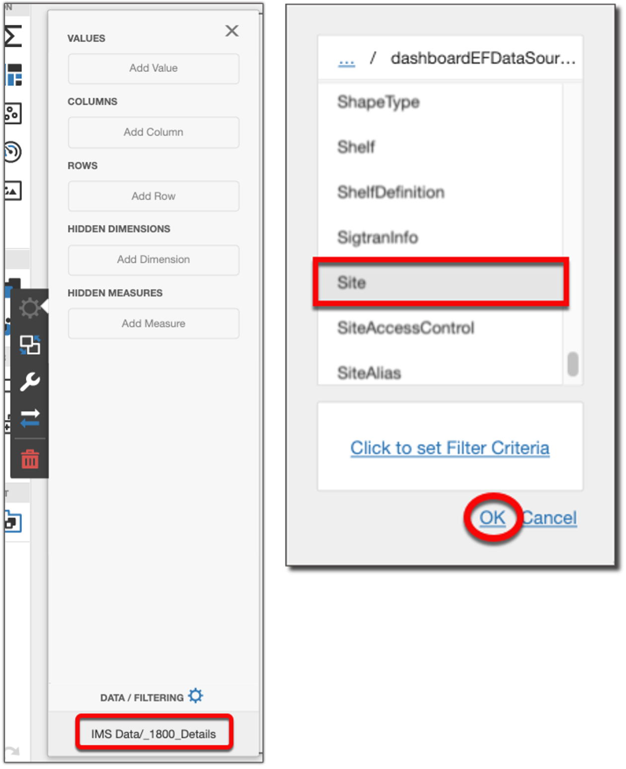
▪Click the OK button
You should now see a reference to the Site class.
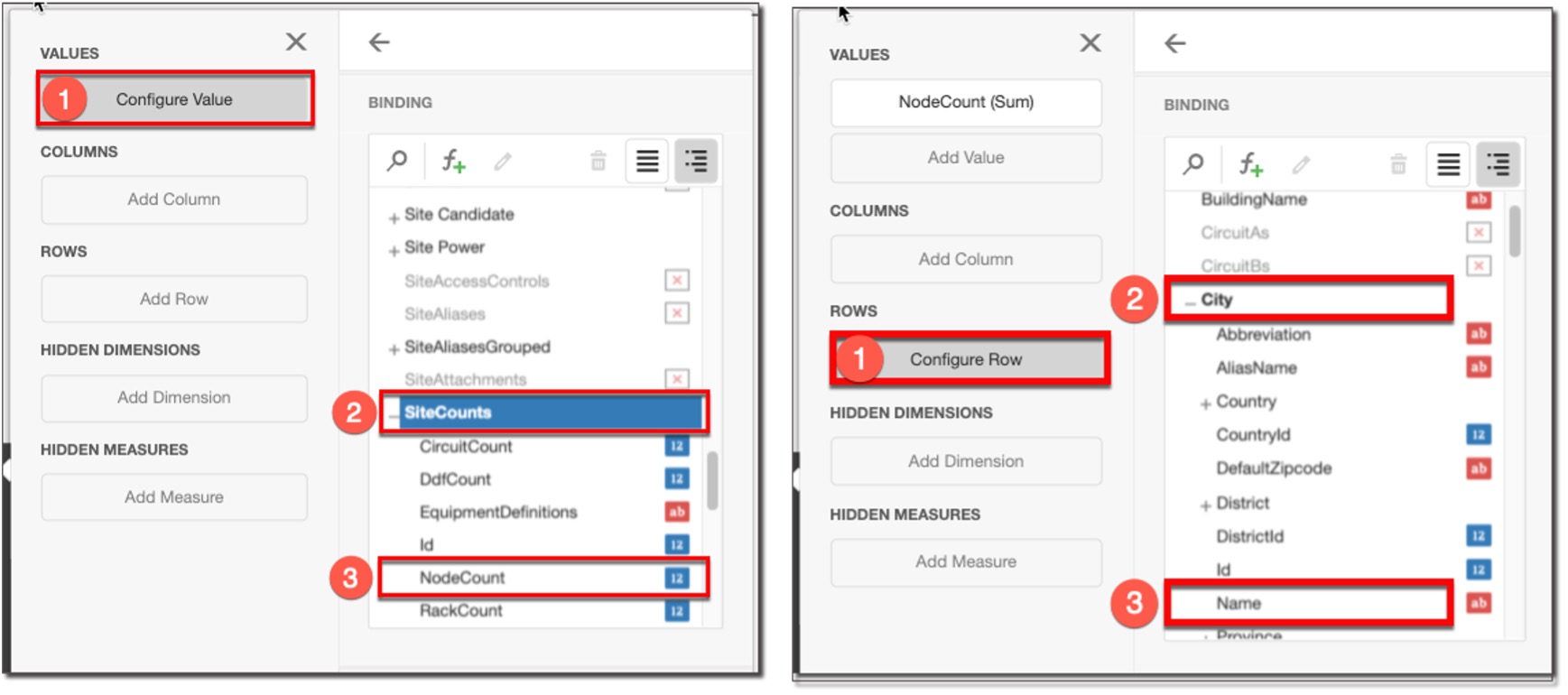
Now we need to choose the data fields for this pivot table.
Select the following in the placeholders:
▪Values: SiteCounts followed by NodeCounts
▪Rows: City followed by Name
This produces an output as follows:
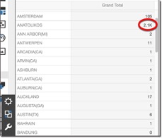
The next step is to format the numeric values. In this case we don’t want thousands to be abbreviated with K.
▪Once again, from the Binding ![]() option in the menu, click on the Values placeholder, then select the Format option and change the following further options – see next screen shot:
option in the menu, click on the Values placeholder, then select the Format option and change the following further options – see next screen shot:
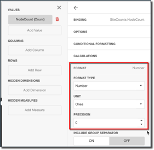
oFormat type: Number
oUnit: Ones
oPrecision: 0
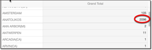
Return to your Pivot Grid and you should notice the difference in numeric output display:
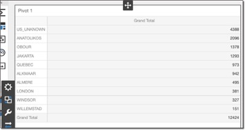
In this example there are many cities displayed. It might be that we just want the top 10 cities with the greatest number of nodes, or even the lowest 10 cities with the least number of nodes.
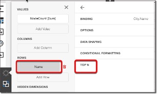
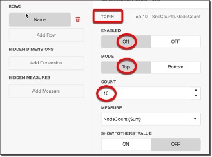
▪From the Rows placeholder, click on Name, then TOP N option and select the following sub options:
oEnabled: ON
oMode: Top
oCount: 10
In this example then we want the top 10 cities with the greatest number of nodes.
The row output is now vastly reduced as seen in the following screenshot:
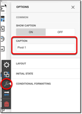
Finally for this section we will rename this dashboard item from its default to something meaningful.
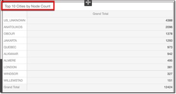
▪Select the Options icon (spanner), locate the Caption option and simply rename Pivot 1 to something that best describes your output. In this case Top 10 Cities by Node Count
The result is:
Now Save your work before proceeding any further.
Dashboard 3.2 – Pie Chart: Nodes by Vendor:
Overview
In this exercise we will:
i. |
Produce a pie chart that displays the total number of nodes grouped by vendor |
ii. |
Reformat labels |
iii. |
Eliminate one item from the report through filtering (outlier data) |
iv. |
Rename Pie chart title |
Using the same report as the Pivot Table, we will now add a Pie Chart to this report:
▪Click on the pie icon in the toolbox and drag it onto the same dashboard area as the Pivot table.
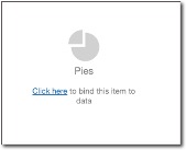
▪We will now bind this item to a data source by selecting the Click here link in the centre of the dashboard, just underneath the Pies emblem.
In the same way we did in the previous exercise, go ahead and complete the following data binding options:
oData Source: EquipmentDefinition
oValues: EquipmentDefinitionCounts/NodeCounts
oArguments: EquipmentDefinition/Vendor/Name
You should now have a pie chart similar to this:

We will give this pie chart a suitable title and refine the label formatting to show number of node units rather than the default percentage figure.
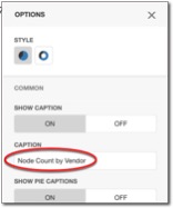
▪Click on the Pie dashboard background, and select the Options icon (spanner)
![]()
▪Under the Caption option, replace the default title to something like Node Count by Vendor.
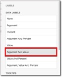
▪Now to format the labels click on the Labels option and select Argument and Value from the Data Labels list.
Now let’s reformat the numerical value from its default K (thousands) units, to ones.
▪Click on the Binding icon, select the Values placeholder, select the Format option, and insert the following values:
oFormat type: Number
oUnit: Ones
oPrecision: 0
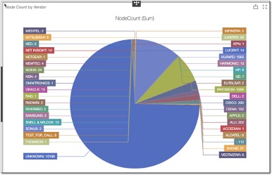
The result can be seen in the screenshot above.
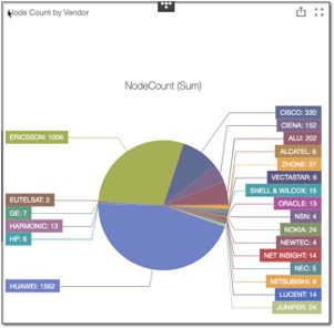
Notice how there is a large section of the pie chart where the Vendor name is unknown. This is skewing the graph, so let’s remove this one vendor instance, and then review the output.
|
Even if in your example you do not encounter this, go ahead and try this filtering out of a particular Vendor of your choice. |
Graphs like these are helpful in also drawing our attention to outlying data, in this case an unknown vendor with way too many nodes associated to it.
Click on the Binding icon, select the Click to set Filter Criteria link
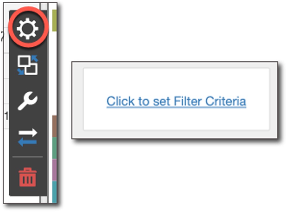
This opens up the Filter Editor.
▪As in a previous exercise, hover over the And button to reveal the green + sign, select it and construct your filter by clicking on each of the 3 options giving them the following values:
oName, Does Not Equal, and Unknown
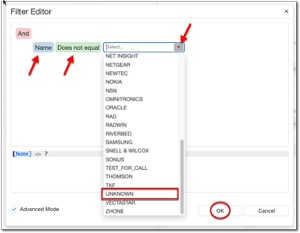
The Advanced Mode option reveals how the filter expression is built.
▪Click the OK button to finish.
▪Now save your work.
The result should look similar the next screenshot.
Your second dashboard exercise is now complete and the overall dashboard that you created will contain two elements, a pivot table, and a pie chart.
