|
This chapter is informational only and will explain some of the various components of the reporting tool so that you become familiar with the components’ functions and their names.
If you don’t want to read through this chapter, maybe because you are somewhat familiar with the DevExpress layout and features already, then you can go straight to the chapter on 'Getting Started' in order to proceed with the exercises.
For a fuller and more detailed understanding of the DevExpress reporting tool, you can go to their web site at (as of the time of writing this document):
In subsequent chapters we will be creating several reports and will draw upon information contained within this Chapter. |
Design Surface
The Design Surface displays a report that is being edited
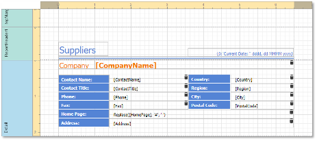
Figure 1 - Design Surface
Rulers
The horizontal ruler allows you to modify the report’s side margins by moving the left and right sliders on the ruler.
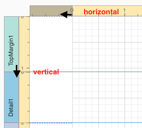
Figure 2 - Rulers
You can move a report band’s vertical ruler resizing rectangles to change its height.
Band Captions
In the Report Designer, each report band carries a caption, the tab title and color, which depends on the band kind. These captions are not printed in the resultant report document and are only visible at design time.
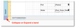
Figure 3 - Band Resizing
You can expand or collapse a band’s content at design time by clicking the tab on the left side of the band.
To access a band’s properties, click the band’s caption and switch to the Properties Panel.
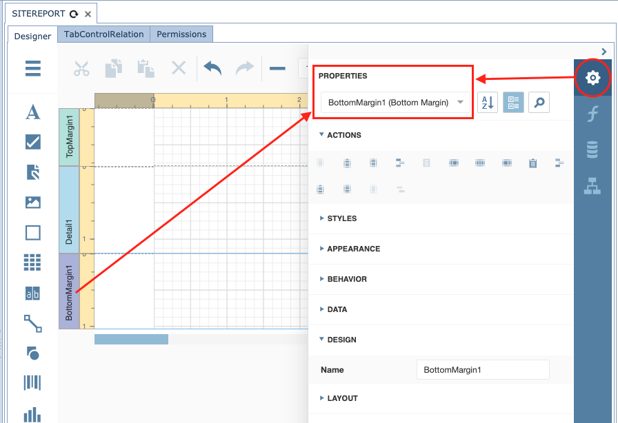
Figure 4 - Band Properties
Data Binding Indication
The Report Designer displays a database barrel icon
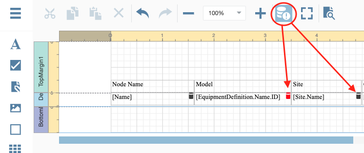
Figure 5 - Validate Bindings
You can click the Validate Bindings toolbar button seen in Figure 5 to highlight report controls with invalid expression/data bindings (red barrel).
This allows you to determine if the specified expression has an incorrect syntax or uses non-existing data source fields.
In-Place Editors
In-place editors allow you to edit the text-oriented controls’ content by double-clicking them.
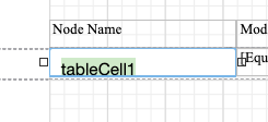
Figure 6 - Edit Field Name
You can switch between a report’s Design and Preview mode using the corresponding buttons in the Main Toolbar.
Field List
This section describes the Field List panel that enables you to explore and manage report data sources and
parameters as well as create bound report controls.
Manage Report Data Sources
The Field List shows available report data sources and their structure.
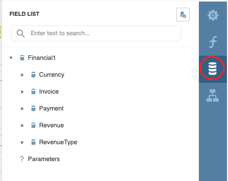
Figure 7 - Field List
The following actions are available in the Field List for data source customization:
Button |
Description |
|
Invokes a list of default data sources that you can add to a report. |
|
Removes the selected data source |
|
Calculated field editor |
|
Adds a new calculated field to the data source |
Table 1 - Field List Icons
Create Bound Report Elements
The Field List allows you to create new bound report controls and bind existing controls to data.
To add a new data-bound report control, drag the required data field from the Field List onto a report band. This creates a control of an appropriate type and binds it to the selected field.
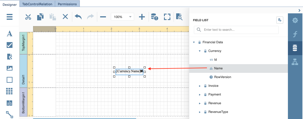
Figure 8 - Data Binding to Report Field
|
If you have created the control field first and want to then bind it with a data field from the data source, you can simply select the data source field from the Field List, and then drag and drop it onto your control field. |
Manage Report Parameters
It is beyond the scope of this document to fully explain Report Parameters. For detailed usage please refer to DevExpress web site for further details.
|
At the time of writing this document, the relevant URL is: https://docs.devexpress.com/XtraReports/4812/detailed-guide-to-devexpress-reporting/shape-report-data/use-report-parameters?v=19.2
|
Main Menu
The Web Report Designer menu is invoked by clicking the menu button in the upper-left corner of the designer’s user interfaces.
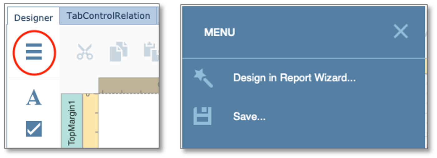
From here you can Save your work and launch the Report Wizard.
Main Toolbar
The Main Toolbar provides access to the report editing commands i

Figure 10 - Main Toolbar
Clipboard Commands
Use these commands to place the selected elements in the clipboard and paste them onto the required report bands
Icon |
Description |
|
Cuts the selected control to the clipboard |
|
Copies the selected control to the clipboard |
|
Pastes a control from the clipboard onto the selected report band |
Table 2 - Edit Commands
Edit Commands
The following commands allow you to delete report elements and cancel previous actions
Icon |
Description |
|
Cancels the last change made to the document |
|
Reverses the last undo action |
|
Deletes the selected control |
Table 3 - Edit Commands
View Commands
Use the commands below to adjust the report zoom factor
Icon |
Description |
|
Increases the document’s current zoom factor by 5 percent |
|
Decreases the document’s current zoom factor by 5 percent |
|
Zooms to a specific zoom factor selected from the dropdown list |
Table 4 - View Commands
Mode and Validation Command
The following commands enable you to toggle between Report Designer’s modes and also Validate data bindings.
Icon |
Description |
|
Switches to the Full Screen mode |
|
Switches to the Preview mode |
|
Highlights report controls with invalid data bindings or incorrect expressions |
Table 3 - Mode and Validation Commands
Properties Panel
This document describes how to use the Properties panel to access and customize the report and report element properties
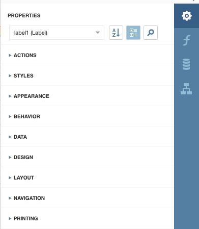
Figure 11 - Properties Panel
A report element’s properties can be accessed in several ways:
Select a Report Element
1.Select an element from the drop-down list at the top of the Properties panel
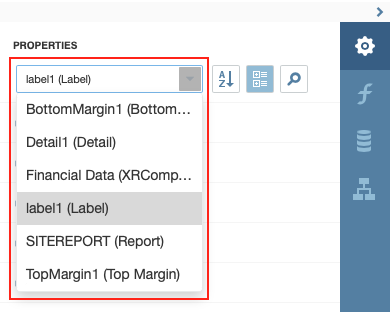
Figure 12 - Properties
This will reveal the group of the element’s properties
2.Click an element on the Design Surface and click the  button to invoke the Properties panel.
3.Select an element in Report Explorer  and click the
  button
Switch Between Display Modes
Element settings can appear in alphabetical order or in categories based on their purpose. Use the buttons next to the selected element to switch between these display modes.
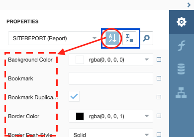
Figure 13 - Properties
Change Property Values
Each record consists of a property’s caption, a value editor, and an optional property marker. To change a property’s value, select the property and specify its value in the editor.
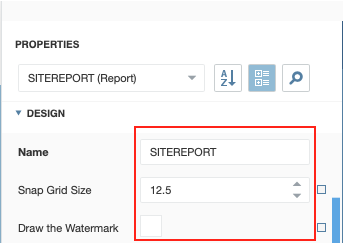
Figure 14 - Property Values
You can also reset the property values to their default ones by right clicking on the small square at the end of the property item.
|
The Reset command resets the expression and the value you specified in the property’s editor |
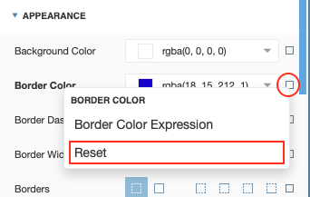
Figure 15 - Property Reset Value
Specify Expressions
The Properties panel allows you to specify expressions that can include two or more data fields and various functions. Click a property marker to see whether the invoked context menu has the PropertyName Expression item
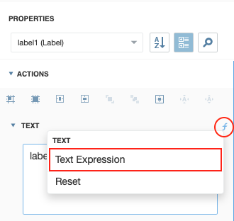
Figure 16 - Text Expression
Click this item to specify an expression in the invoked Expression Editor popup window that follows next.
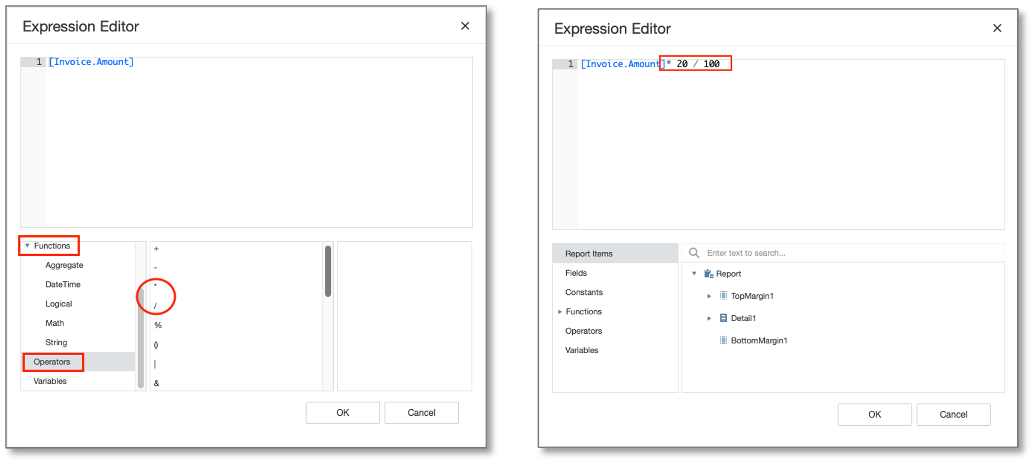
Figure 17 - Expression Editor
In Figure 17 we calculated this fields to be 20% of an existing given value, by selecting a function option.
The Properties panel highlights properties that have an assigned expression. An empty expression will show a small square, one with content will show a small F (function symbol) as seen in Figure 18.
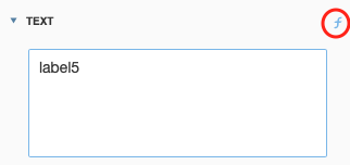
Figure 18 - Label Field with Expression
Search Properties
Click the  button to show the search box. When you type in the search box, the Properties panel filters the list of available properties and highlights the search string in the records.
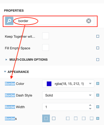
Figure 19 - Properties Search
In this example we searched for the term ‘border’ resulting in 4 hits and location where these properties can be found
Use Actions
In the categorized mode, the Properties panel contains the context-sensitive Actions group that provides the most used actions for the selected report element
The following screenshots show a Report and Label level action properties. In this case adding report bands and alignment type actions.
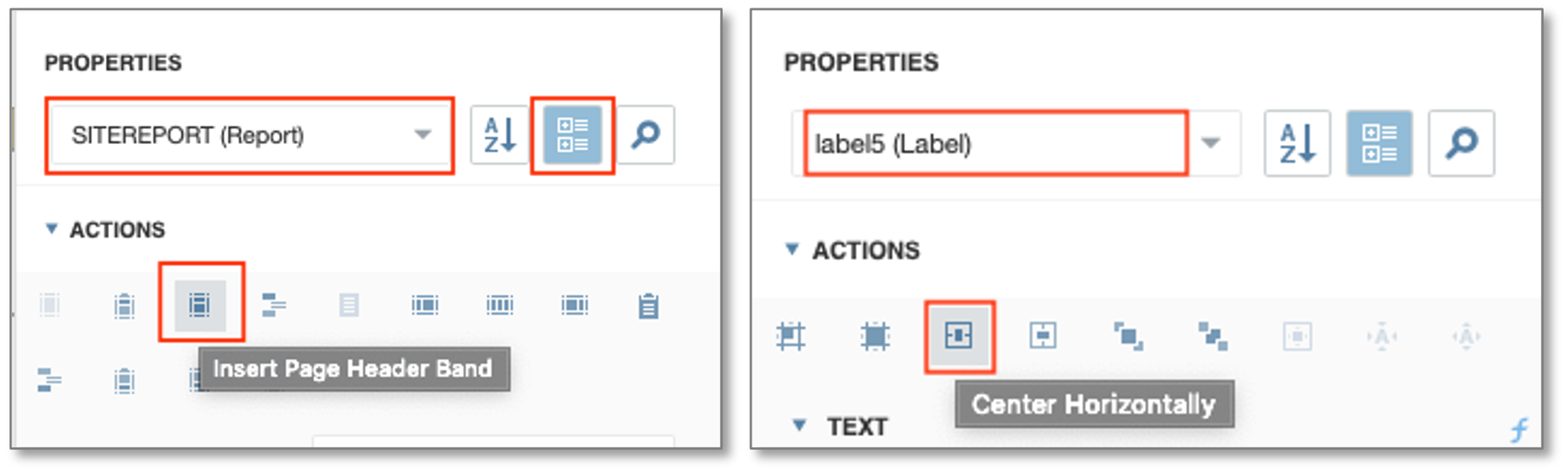
Figure 20 - Report and Label Action Properties
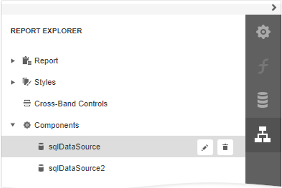
Report Explorer
The Report Explorer panel shows a report’s structure and provides access to report elements, styles, and components.
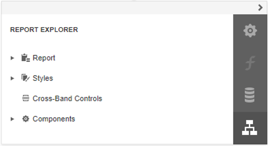
Manage Report Elements
Report Explorer displays all report controls and bands in a tree-like form.

The following actions are available to customize report elements:
Button |
Description |
|---|---|
|
Deletes the selected report element. Note that this button is not available for the Detail, Top Margin, and Bottom Margin bands. |
|
Switches to the Properties Panel where you can adjust the selected report elements or the entire report’s settings. |
You can use drag-and-drop for the following operations:
•Reorder report controls, or move them from one band to another.
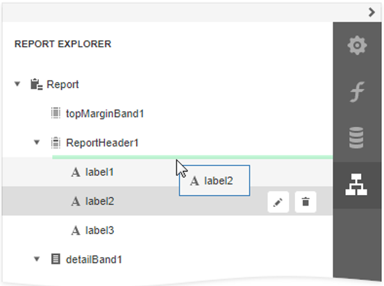
•Reorder Detail Report bands or move them inside / outside other bands.
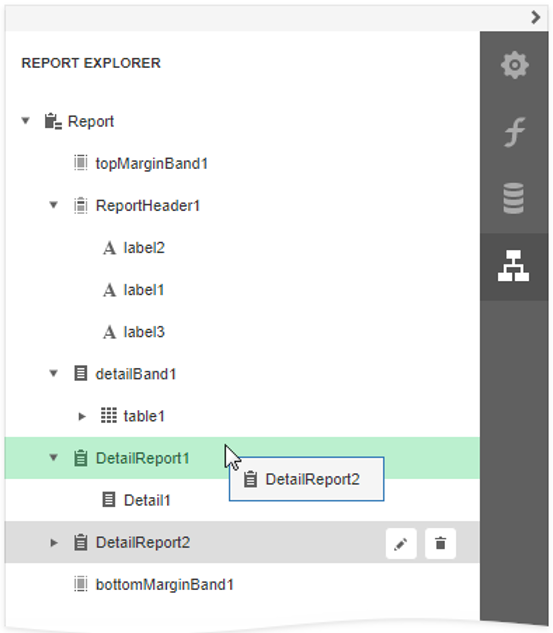
•Reorder Group Header and Group Footer bands.
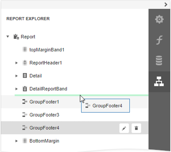
•Reorder table cells or move them between table rows. Reorder table rows.
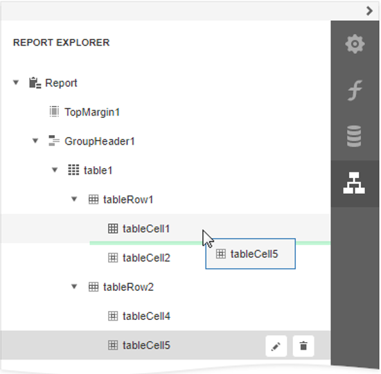
An acceptable drop target is highlighted in green when you drag an item over it. An unacceptable target is highlighted in red.
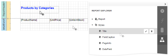
Manage Report Styles
Expand the Styles category in Report Explorer to access the report style collection.
To apply a style to a report control, drag a style item from Report Explorer onto this control.
You can use the following actions to customize report styles:
Button |
Description |
|---|---|
|
Creates a new style. |
|
Deletes the selected style. |
|
Switches to the Properties Panel where you can adjust the selected style’s settings. |
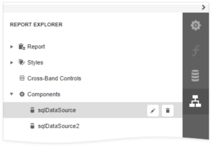
Manage Data Sources
The Report Explorer shows available report data sources in the Components category. This list is synchronized with data sources from the Field List panel.
The following actions are available to customize data sources:
Button |
Description |
|
Deletes the selected data source. |
|
Switches to the Properties Panel where you can rename the selected data source.
|